

A linear equation in mathematical subjects usually produces a line graph when mapped on a spreadsheet. The equation takes the form y = MX + b, where m is the gradient of the line and b is the y-intercept. In this case, C can also apply. Microsoft Excel cannot draw linear equations directly; in order to graph a linear equation in Excel, you must have a table of at least two values for the mathematical equation/function already labeled in two X and Y columns with column headers. You will then follow the following simple steps in this article that prepare you to make the graph in Excel.
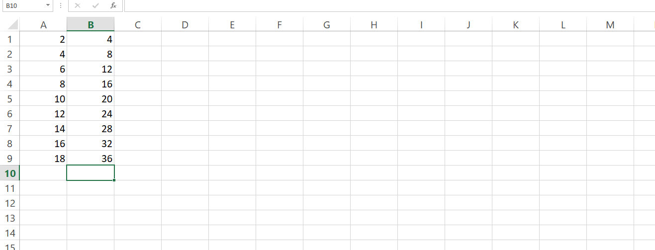
1. Insert a set of values in column A.
2. Insert another set of values in column B.
3. Select all boxes containing the data without including the titles. This is in order to set the data range.
4. Click on Insert then click on Scatter.

5. Select the opening option.
6. Right-click on your mouse in the graph then click Series 1>Edit. Ensure that Xand Y values are properly selected.

7. Go to the Chart Tools and click on Layout Tab.
8. Click on Axis Titles and type the titles on both axes. The units of these titles MUST be correctly indicated.
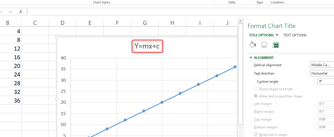
9. Click on Chart Title in order to add the title for the whole worksheet.
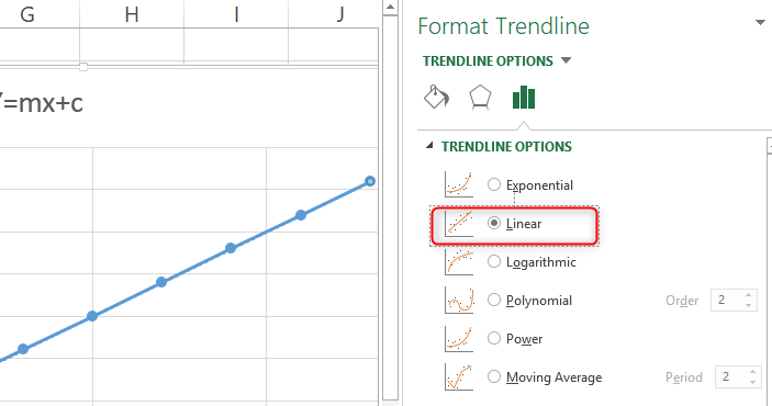
10. Right-click on your datapoints> Select 'Add Trendline'. This will drag a straight line through your data.

11. Click on 'Linear Regression'. Click on 'Set intercept' and add zero 0 on the box if your plots go through the origin.
12. Click on 'Show equation' in order to ensure your equation is in the form y=mx+c.
13. In order to adjust the axis, right-click on the axis the select "Format axis'
ALTERNATIVELY, you may also follow the simple steps laid out below.
1. Open a blank spread/ worksheet on Excel.
2. Enter the data in columns A and B.
3. Highlight the data points.
4. Click on 'Insert'.
5. Click 'Chart' >Chart Wizard >Click XY (scatter)

6. Click 'Finish'. At this point, a plotted graph or chart will appear.
7. Right-click on the blue slope then Add Trendline.

8. Go to Options Tab and click OK.
The y=mx+c equation appears in the graph on your spreadsheet.
You may also want to determine the slope or gradient of your graph. Once you enter your data and have created a graph in the Excel spreadsheet, it can also help you determine the slope of the graph.
Finding the slope of your graph will include the following simple steps.
1. Right-click your mouse on any of the data points in your graph.
2. Click on 'Add trendline' followed by Display equation on Chart.

3. Examine your equation which is in the form of y=mx+c. M and B number in this case while c is our constant. The value of M is the slope of your graph. For example, if the equation is y=6x+8, 6 is our slope.